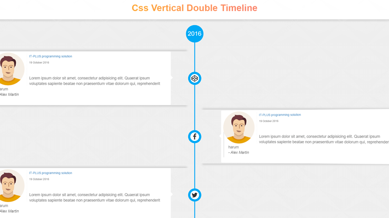
Comments & Feeadbacks & History Timeline
Chia sẻ
Dòng thời gian Comment khá đẹp mắt
1. HTML
<header>
  <div class="container">
    <h1 class="text-center text-danger grad-over">Double Vertical Timeline</h1>

  </div></header><br><br>
  <section id="timeline-wrapper">
    <div class="container-fluid">
      <div class="row">
        <div class="timeline-top">
          <div class="top-year">2018</span></div>

        </div>
        <div class="timeline-block">
          <div class="timeline-events">
            <br>
            <div class="event l-event col-md-6 col-sm-6 col-xs-8 "><span class="thumb fa fa-codepen"></span>
              <div class=" event-body">
                <div class="person-image pull-left "><img src="https://cdn1.iconfinder.com/data/icons/user-pictures/100/male3-512.png" alt="person" /></div>
<div class="event-content">
<h5 class="text-primary text-left">IT-PLUS programming solution </h5>
<span class="text-muted text-left" style="display:block; margin: 0"><small>19 October 2016</small></span>
<br><br>
                <blockquote class="text-muted text-left">Lorem ipsum dolor sit amet, consectetur adipisicing elit. Quaerat ipsum voluptates sapiente beatae non praesentium vitae dolorum qui, reprehenderit harum <br>
<cite class="text-muted text-right text-bold">- Alex Martin</cite>
</blockquote>

</div>
              </div> <!-- end of event body -->
<div class="clear-fix"></div>
            </div><!-- end of left event -->
            <div class="row"></div>
            <div class="event r-event col-md-6 col-sm-6 col-xs-8 "><span class="thumb fa fa-facebook"></span>
              <div class=" event-body">
                <div class="person-image pull-left "><img src="https://cdn1.iconfinder.com/data/icons/user-pictures/100/male3-512.png" alt="person" /></div>
<div class="event-content">
<h5 class="text-primary text-left">IT-PLUS programming solution </h5>
<span class="text-muted text-left" style="display:block; margin: 0"><small>19 October 2016</small></span>
<br><br>
                <blockquote class="text-muted text-left">Lorem ipsum dolor sit amet, consectetur adipisicing elit. Quaerat ipsum voluptates sapiente beatae non praesentium vitae dolorum qui, reprehenderit harum <br>
<cite class="text-muted text-right text-bold">- Alex Martin</cite>
</blockquote>

</div>
              </div>
            </div><!-- end of right event <-->
              <div class="clearfix"></div>
            </-->
            <div class="row"></div>
            <div class="event l-event col-md-6 col-sm-6 col-xs-8 "><span class="thumb fa fa-twitter"></span>
              <div class=" event-body">
                <div class="person-image pull-left "><img src="https://cdn1.iconfinder.com/data/icons/user-pictures/100/male3-512.png" alt="person" /></div>
<div class="event-content">
<h5 class="text-primary text-left">IT-PLUS programming solution </h5>
<span class="text-muted text-left" style="display:block; margin: 0"><small>19 October 2016</small></span>
<br><br>
                <blockquote class="text-muted text-left">Lorem ipsum dolor sit amet, consectetur adipisicing elit. Quaerat ipsum voluptates sapiente beatae non praesentium vitae dolorum qui, reprehenderit harum <br>
<cite class="text-muted text-right text-bold">- Alex Martin</cite>
</blockquote>
                </div>
</div>
            </div><!-- end of left event <-->
              <div class="clearfix"></div>

            <div class="row"></div>
            <div class="event r-event col-md-6 col-sm-6 col-xs-8 ">
              <span class="thumb fa fa-codepen"></span>
             <div class=" event-body">
                <div class="person-image pull-left "><img src="https://cdn1.iconfinder.com/data/icons/user-pictures/100/male3-512.png" alt="person" /></div>
<div class="event-content">
<h5 class="text-primary text-left">IT-PLUS programming solution </h5>
<span class="text-muted text-left" style="display:block; margin: 0"><small>19 October 2016</small></span>
<br><br>
                <blockquote class="text-muted text-left">Lorem ipsum dolor sit amet, consectetur adipisicing elit. Quaerat ipsum voluptates sapiente beatae non praesentium vitae dolorum qui, reprehenderit harum <br>
<cite class="text-muted text-right text-bold">- Alex Martin</cite>
</blockquote>
                </div>
</div>
            </div><!-- end of right event <-->
              <div class="clearfix"></div>
            </-->
          </div><!-- end of timeline events -->
          <div class="clearfix"></div>
        </div>
      </div>
    </div>
  </section>
<br /><hr />
<footer class="text-center">
  <div class="social">
    Follow Me:
    <a target="_blank" href="https://codepen.io/hosamsam/" >
<abbr title="Codepen"><i class="fa fa-codepen follow" ></i></abbr>
    </a>


    <a href="https://github.com/hosam1696"><abbr title="Github" target="_blank"><i class="fa fa-github "></i></abbr></a>
  </div>
</footer>
2. CSS
/* SCSS nhe anh em */

$screen-sm-min : 768px;
$light-blue : #03a9f4;
body {
  font-size: 14px;
  overflow-x:hidden;
  background: linear-gradient(to bottom, rgba(255,255,255,.9), rgba(255,255,255,1) 7%, rgba(204, 204, 204, .8) 7%, rgba(238, 238, 238,.92)
 8%,rgba(238, 238, 238,.9)), url(http://previews.123rf.com/images/egorzem/egorzem1502/egorzem150200017/36422240-Abstract-3d-geometric-background-White-seamless-texture-with--Stock-Photo.jpg);
  header {
    text-align: center;

    .grad-over {
      font-size: 3em;
      font-weight: bold;
      position: relative;
      display: inline-block;
      text-shadow: 2px 2px 2px #fff;
      overflow: hidden;
      &:after {
        content: "";
        position: absolute;
        width: 200%;
        height: 100%;
        background: linear-gradient(90deg, darkorange, mediumvioletred);
        top: 0;
        left: 0;
        mix-blend-mode: screen;
        transition: all 2s ease-in-out;
      }
      &:hover:after {
        left: -100%;
      }
    }
  }

  #timeline-wrapper {
    .timeline-top {
     // background-color: hotpink;
      text-align: center;
      .top-year {
        display:inline-block;
        width: 80px;
        height:80px;
        border-radius: 40px;
        background-color: $light-blue;
        color: #fff;
        line-height: 80px;
        text-align: center;
        font-size: 2.8rem;
        &>span {
          font-size: 3rem
        }
      }
    }
    .timeline-block {
      width: 100%;
      height: auto;
      position: relative;
      //background: linear-gradient(to right, #eee,#eee 50%, rgba(225,225,225,1) 50%, rgba(225,225,225,1));
      &:after {
        content: "";
        position: absolute;
        width: 4px;
        height: 100%;
        background-color: $light-blue;
        left: 50%;
        top: 0;
        margin-left: -2px;
      }

      .timeline-events {
        .l-event {
          float: left;
          position: relative;

          .thumb{
            right: 0;
            transform: translate(50%, -50%);
          }
          &:before,&:after {
            position: absolute;
            content: '';
            color: #333;
            width: 40px;
            height:40px;
            background: #fff;

            transform: translate(50%, -50%);
            border-radius: 20px;
            z-index:4;
            //box-shadow:inset 1px 1px 3px #999;
            top: 50%;right:0
            }
          &:after {
            width: 60px;
            height: 60px;
            z-index:3;
            border-radius: 30px;
            background: $light-blue;

          }
          .event-body {

            &:before {
            position: absolute;
            content: '';
            color: #333;
            width: 16px;
            height:16px;
            background: #fff;
            border-top: 1px solid #eee;
              border-right: 1px solid #eee;
            transform: rotate(45deg) translate(-50%, -50%);
            border-radius: 3px;
            top: 50%;right:-8px
            }
          }
        }
        .r-event {
          float:right;
          position: relative;

          .thumb{
            left: 0;
            transform: translate(-50%, -50%);
          }
          &:before, &:after {
            position: absolute;
            content: '';
            color: #333;
            width: 40px;
            height:40px;
            background: #fff;
            color: #333;
            transform:  translate(-50%, -50%);
            border-radius: 20px;
            top: 50%;left:0px;
            z-index:4;
     //       box-shadow:inset 1px 1px 3px  blue;
            }
          &:after {
            width: 60px;
            height: 60px;
            z-index:3;
            border-radius: 30px;
            background: $light-blue;

          }
          .event-body {
            float: right;
            transform:perspective(1000px) rotateY(-4deg);

            &:before {
              position: absolute;
            content: '';
            color: #333;
            width: 16px;
            height:16px;
            background: #fff;
            border-bottom: 1px solid #eee;
              border-left: 1px solid #eee;
            transform: rotate(45deg) translate(-50%, -50%);
            border-radius: 3px;
            top: 50%;left:-8px;

            }

            }

              }
        }
        .event{
          min-height: 100px;
          background: none;
          position: relative;
          box-shadow: 0px 40px 14px -35px #ccc,0px -40px 14px -35px #ccc;
          margin-top: 20px;
          .thumb {
            font-size: 30px;
            position: absolute;
            top: 50%;
            color:#333;
            z-index: 5
          }
            .event-body {
              background-color: #fff;
              min-height: 100px;
              border-radius: 5px;
              padding: 5px 10px;
              width: 90%;
              position: relative;
              border: 1px solid #eee;
              .person-image {
                display:inline-block;
                text-align:left;
              width: 20%;
              height: 100%;
              margin-right: 10px;
                padding-right: 10px;
                border-right: 1px dashed #eee;
              img{
                width: 100%;
                height: 100%;
              }
              }
        }
      }
    }
  }
  @media (max-width: 768px) {
     #timeline-wrapper {
    .timeline-top {
     // background-color: hotpink;

      text-align: right;
      padding-right: 20%
    }
    }
  .timeline-block {
    width: 100%;
      height: 100vh;
      position: relative;
      background-color: #eee;
      &:after {
        content: "";
        position: absolute;
        height: 100%;
        background-color: #333;
        left: 5%;
        top: 0;
        margin-left: -3px;
        display: none;

        }
    .r-event {
          .event-body {
            &:after {
              content: '';
              position: absolute;
              top: 0;
              width: 6px;
              height: 100%;
              background-color: $light-blue;
              left: -30%;
              border-radius: 3px;
              box-shadow: 1px 1px 1px #fff
            }
          }
    }
    .l-event {
          .event-body {
            &:after {
              content: '';
              position: absolute;
              top: 0;
              width: 6px;
              height: 100%;
              background-color: $light-blue;
              right: -30%;
              border-radius: 3px;
              box-shadow: -1px 1px 1px #fff
            }
          }
    }
  }
}
.footer-up {
    bottom:0
  }
footer {

    background: #fff;
    padding: 10px 0;
  border-top: 1px solid #eee;
    transition: bottom 1s ease-in-out;
    position: fixed;
  width: 100%;
  bottom: -100%;
  left: 0;
  z-index: 9;
  a {
    padding: 5px
  }
  }
  .social {
  color: #999;
  letter-spacing: 1px;
    i{
  background: #eee;
  color: #777;
  padding: 5px;
  border-radius: 50%;

}
i:hover {
  color: #111;
}
.follow {
  animation: light .8s ease-in-out infinite forwards
}
}

@keyframes light {
  to{color: #111}
}
}
3. JAVASCRIPT
$(function() {

var watchScroll =0;
var rightComments = $('.r-event .event-body');
  var leftComments = $('.l-event .event-body');
  TweenMax.staggerFrom(rightComments, 1, {x: 100, ease:Bounce.easeOut},1);
  TweenMax.staggerFrom(leftComments, 1, {x: -100,ease:Bounce.easeOut},1);

  $(window).on('scroll', function() {
    var scrollTop = $(window).scrollTop();
    (scrollTop > watchScroll)?
    $('footer').addClass('footer-up'):
      $('footer').removeClass('footer-up');

    watchScroll = scrollTop;
  })
})
Mong bài viết giúp ích được các bạn phần nào trong thiết kế Web. Hãy nhấn nút Chia sẻđể mọi người cùng học hỏi kiến thức mới nhé. Cảm ơn các bạn đã quan tâm Forum.