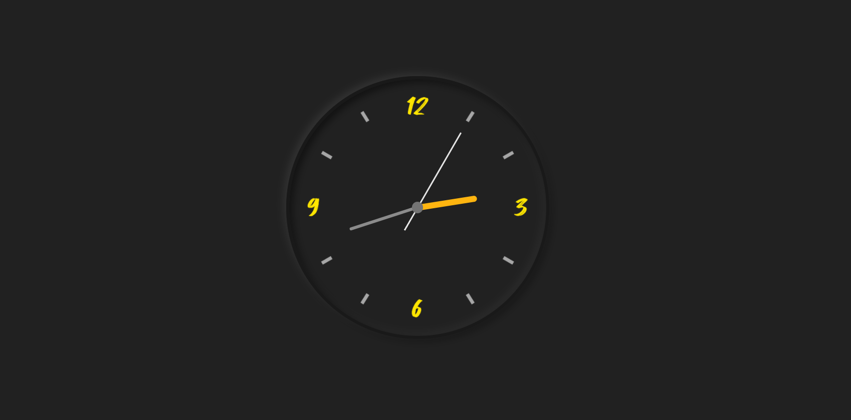
Đồng hồ kim với CSS và Javascript
Chia sẻ
DevForum chia sẻ các bạn mẫu code Đồng Hồ Kim tông đen ngầu với CSS và Javascript
1. HTML
<div class="clock">

    <div class="hour">
      <div class="hr" id="hr"></div>
    </div>

    <div class="min">
      <div class="mn" id="mn"></div>
    </div>

    <div class="sec">
      <div class="sc" id="sc"></div>
    </div>

  </div>
2. CSS
* {
      margin: 0;
      padding: 0;
      box-sizing: border-box;
    }

    body {
      display: flex;
      justify-content: center;
      align-items: center;
      min-height: 100vh;
      background: #212121;
    }

    .clock {
      display: flex;
      width: 350px;
      height: 350px;
      justify-content: center;
      align-items: center;
      background: url(http://samuel-garcia.site/img/clock-sam.png);
      background-size: cover;
      border: 4px solid #191919;
      border-radius: 50%;
      box-shadow: -4px -4px 10px rgba(67, 67, 67, 0.5), inset 4px 4px 10px rgba(0, 0, 0, 0.5), inset -4px -4px 10px rgba(67, 67, 67, 0.3), 4px 4px 10px rgba(0, 0, 0, 0.3);
    }

    .clock:before {
      content: "";
      position: absolute;
      width: 15px;
      height: 15px;
      background: #747474;
      border-radius: 50%;
      z-index: 999;
    }

    .clock .hour,
    .clock .min,
    .clock .sec {
      position: absolute;
    }

    .clock .hour, .hr {
      width: 160px;
      height: 160px;
    }

    .clock .min, .mn {
      width: 190px;
      height: 190px;
    }

    .clock .sec, .sc {
      width: 230px;
      height: 230px;
    }

    .hr, .mn, .sc {
      display: flex;
      justify-content: center;
      /*align-items: center;*/
      position: absolute;
      border-radius: 50%;
    }

    .hr:before {
      content: "";
      position: absolute;
      width: 8px;
      height: 80px;
      background: #ffb510;
      z-index: 9;
      border-radius: 6px 6px 0 0;
    }

    .mn:before {
      content: "";
      position: absolute;
      width: 4px;
      height: 90px;
      background: #8b8b8b;
      z-index: 10;
      border-radius: 6px 6px 0 0;
    }

    .sc:before {
      content: "";
      position: absolute;
      width: 2px;
      height: 150px;
      background: #e5e5e5;
      z-index: 11;
      border-radius: 6px 6px 0 0;
    }
3. JAVASCRIPT
const deg = 6;
    const hr = document.querySelector('#hr');
    const mn = document.querySelector('#mn');
    const sc = document.querySelector('#sc');
    setInterval(() => {
      let day = new Date();
      let hh = day.getHours() * 30;
      let mm = day.getMinutes() * deg;
      let ss = day.getSeconds() * deg;
      hr.style.transform = `rotateZ(${(hh)+(mm/12)}deg)`;
      mn.style.transform = `rotateZ(${mm}deg)`;
      sc.style.transform = `rotateZ(${ss}deg)`;
    })
Mong bài viết giúp ích được các bạn phần nào trong thiết kế Web. Hãy nhấn nút Chia sẻđể mọi người cùng học hỏi kiến thức mới nhé. Cảm ơn các bạn đã quan tâm Forum.