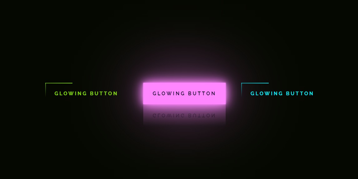
Glowing Button with HTML and CSS
Chia sẻ
DevForum chia sẻ anh em mẫu Button với hiệu ứng Hover kiểu Glowing với HTML và CSS
1. HTML
<a href="#">
		<span></span>
		<span></span>
		<span></span>
		<span></span>
		Glowing button
	</a>
	<a href="#">
		<span></span>
		<span></span>
		<span></span>
		<span></span>
		Glowing button
	</a>
	<a href="#">
		<span></span>
		<span></span>
		<span></span>
		<span></span>
		Glowing button
	</a>
2. CSS
@import url("https://fonts.googleapis.com/css2?family=Raleway:wght@400;700&display=swap");
		* {
			margin: 0;
			padding: 0;
			box-sizing: border-box;
		}
		body {
			display: flex;
			justify-content: center;
			align-items: center;
			height: 100vh;
			background: #050801;
			font-family: "Raleway", sans-serif;
			font-weight: bold;
		}
		a {
			position: relative;
			display: inline-block;
			padding: 25px 30px;
			margin: 40px 0;
			color: #03e9f4;
			text-decoration: none;
			text-transform: uppercase;
			transition: 0.5s;
			letter-spacing: 4px;
			overflow: hidden;
			margin-right: 50px;
		}
		a:hover {
			background: #03e9f4;
			color: #050801;
			box-shadow: 0 0 5px #03e9f4, 0 0 25px #03e9f4, 0 0 50px #03e9f4,
			0 0 200px #03e9f4;
			-webkit-box-reflect: below 1px linear-gradient(transparent, #0005);
		}
		a:nth-child(1) {
			filter: hue-rotate(270deg);
		}
		a:nth-child(2) {
			filter: hue-rotate(110deg);
		}
		a span {
			position: absolute;
			display: block;
		}
		a span:nth-child(1) {
			top: 0;
			left: 0;
			width: 100%;
			height: 2px;
			background: linear-gradient(90deg, transparent, #03e9f4);
			animation: animate1 1s linear infinite;
		}
		@keyframes animate1 {
			0% {
				left: -100%;
			}
			50%,
			100% {
				left: 100%;
			}
		}
		a span:nth-child(2) {
			top: -100%;
			right: 0;
			width: 2px;
			height: 100%;
			background: linear-gradient(180deg, transparent, #03e9f4);
			animation: animate2 1s linear infinite;
			animation-delay: 0.25s;
		}
		@keyframes animate2 {
			0% {
				top: -100%;
			}
			50%,
			100% {
				top: 100%;
			}
		}
		a span:nth-child(3) {
			bottom: 0;
			right: 0;
			width: 100%;
			height: 2px;
			background: linear-gradient(270deg, transparent, #03e9f4);
			animation: animate3 1s linear infinite;
			animation-delay: 0.5s;
		}
		@keyframes animate3 {
			0% {
				right: -100%;
			}
			50%,
			100% {
				right: 100%;
			}
		}

		a span:nth-child(4) {
			bottom: -100%;
			left: 0;
			width: 2px;
			height: 100%;
			background: linear-gradient(360deg, transparent, #03e9f4);
			animation: animate4 1s linear infinite;
			animation-delay: 0.75s;
		}
		@keyframes animate4 {
			0% {
				bottom: -100%;
			}
			50%,
			100% {
				bottom: 100%;
			}
		}
3. JAVASCRIPT
Mong bài viết giúp ích được các bạn phần nào trong thiết kế Web. Hãy nhấn nút Chia sẻđể mọi người cùng học hỏi kiến thức mới nhé. Cảm ơn các bạn đã quan tâm Forum.