Metal Button with CSS
Chia sẻ
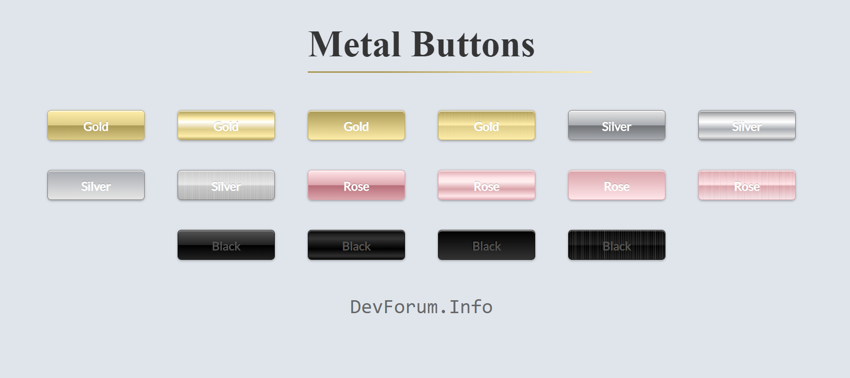
DevForum chia sẻ các bạn code Button với tông màu Kim Loại chất lừ
1. HTML
<h1>Metal Buttons</h1>
	<div class="frame">
		<button class="custom-btn btn-1">Gold</button>
		<button class="custom-btn btn-2">Gold</button>
		<button class="custom-btn btn-3">Gold</button>
		<button class="custom-btn btn-4">Gold</button>
		<button class="custom-btn btn-5">Silver</button>
		<button class="custom-btn btn-6">Silver</button>
		<button class="custom-btn btn-7">Silver</button>
		<button class="custom-btn btn-8">Silver</button>
		<button class="custom-btn btn-9">Rose</button>
		<button class="custom-btn btn-10">Rose</button>
		<button class="custom-btn btn-11">Rose<div class="dot"></div></button>
		<button class="custom-btn btn-12">Rose</button>
		<button class="custom-btn btn-13">Black</button>
		<button class="custom-btn btn-14">Black</button>
		<button class="custom-btn btn-15">Black</button>
		<button class="custom-btn btn-16">Black</button>
		<p style="font-family: Andale Mono, monospace;">
		DevForum.Info</p>
	</div>
2. CSS
body {
			background: #e0e5ec;
		}
		h1 {
			position: relative;
			text-align: center;
			color: #353535;
			font-size: 50px;
			font-family: "Cormorant Garamond", serif;
		}
		h1:before{
			position: absolute;
			content: "";
			bottom: -10px;
			width: 30%;
			height: 2px;
			background-color: #98d9e1;
			background-image: linear-gradient(315deg, #fea 0%, #a95 74%);
		}

		p {
			font-family: 'Lato', sans-serif;
			font-weight: 300;
			text-align: center;
			font-size: 20pt;
			color: #676767;
		}
		.frame {
			width: 90%;
			margin: 40px auto;
			text-align: center;
		}
		button {
			margin: 20px;
		}
		.custom-btn {
			width: 130px;
			height: 40px;
			color: #fff;
			border-radius: 5px;
			padding: 10px 25px;
			font-family: 'Lato', sans-serif;
			font-size: 16px;
			font-weight: 900;
			font-style: normal;
			text-shadow: 0px -1px 0px rgba(0,0,0,0.4);
			text-decoration: none;
			background: transparent;
			cursor: pointer;
			position: relative;
			display: inline-block;
			box-shadow: inset 0px 1px 0px rgba(255,255,255,1),0px 1px 3px rgba(0,0,0,0.3);
			outline: none;
			border: 1px solid #ba6;
		}
		.custom-btn:active{
			-webkit-transform: translateY(2px);
			transform: translateY(2px);
		}

		/* 1 */
		.btn-1{
			backface-visibility: hidden;
			position: relative;
			cursor: pointer;
			display: inline-block;
			white-space: nowrap;
			background: linear-gradient(180deg,#fea 0%,#dc8 49%,#a95 51%,#dc8 100%);
			border-radius: 5px;
		}

		/* 2 */
		.btn-2{
			background: linear-gradient(top, #a95, #f2f2f2 25%, #ffffff 38%, #c5c5c5 63%, #f7f7f7 87%, #a95);
			background: -webkit-linear-gradient(top, #a95, #fea 25%, #ffffff 38%, #dc8  63%, #fea 87%, #a95);
		}

		/* 3 */
		.btn-3{
			background: -webkit-gradient(linear, left top, left bottom, from(#a95), to(#fea));
		}

		/* 4 */
		.btn-4{
			color: #fff;
			background-image: -webkit-repeating-linear-gradient(left, rgba(255, 238, 170, 0) 0%, rgba(255, 238, 170, 0) 3%, rgba(255, 238, 170, .1) 3.75%),
			-webkit-repeating-linear-gradient(left, rgba(170, 153, 85, 0) 0%, rgba(170, 153, 85, 0) 2%, rgba(170, 153, 85, .03) 2.25%),
			-webkit-repeating-linear-gradient(left, rgba(255, 238, 170, 0) 0%, rgba(255, 238, 170, 0) .6%, rgba(255, 238, 170, .15) 1.2%),

			linear-gradient(180deg, #a95 0%,
				#fea 47%,
				#dc8 53%,
				#fea 100%);

		}

		/* 5 */
		.btn-5{
			backface-visibility: hidden;
			position: relative;
			cursor: pointer;
			display: inline-block;
			white-space: nowrap;
			border-color: #7c7c7c;
			background: linear-gradient(180deg,#e6e6e6 0%,rgba(0, 0, 0, 0.25) 49%, rgba(38, 38, 38, 0.6) 51%,rgba(0, 0, 0, 0.25) 100%);
			border-radius: 5px;
		}

		/* 6 */
		.btn-6{
			border-color: #7c7c7c;
			background: linear-gradient(top, rgba(38, 38, 38, 0.8), #e6e6e6 25%, #ffffff 38%, #c5c5c5 63%, #f7f7f7 87%, rgba(38, 38, 38, 0.8));
			background: -webkit-linear-gradient(top, rgba(38, 38, 38, 0.5), #e6e6e6 25%, #ffffff 38%, rgba(0, 0, 0, 0.25)  63%, #e6e6e6 87%, rgba(38, 38, 38, 0.4));
		}

		/* 7 */
		.btn-7{
			border-color: #7c7c7c;
			background: -webkit-gradient(linear, left top, left bottom, from(rgba(0, 0, 0, 0.25)), to(#e6e6e6));
		}

		/* 8 */
		.btn-8{
			border-color: #7c7c7c;
			background-image: -webkit-repeating-linear-gradient(left, hsla(0,0%,100%,0) 0%, hsla(0,0%,100%,0)   6%, hsla(0,0%,100%, .1) 7.5%),
			-webkit-repeating-linear-gradient(left, hsla(0,0%,  0%,0) 0%, hsla(0,0%,  0%,0)   4%, hsla(0,0%,  0%,.03) 4.5%),
			-webkit-repeating-linear-gradient(left, hsla(0,0%,100%,0) 0%, hsla(0,0%,100%,0) 1.2%, hsla(0,0%,100%,.15) 2.2%),

			linear-gradient(180deg, hsl(0,0%,78%)  0%,
				hsl(0,0%,90%) 47%,
				hsl(0,0%,78%) 53%,
				hsl(0,0%,70%)100%);
		}

		/* 9 */
		.btn-9{
			backface-visibility: hidden;
			position: relative;
			cursor: pointer;
			display: inline-block;
			white-space: nowrap;
			border-color: #D9A3A9;
			background: linear-gradient(180deg,#FFE6E9 0%,#DDA6AE 49%, #B76E79 51%,#DDA6AE 100%);
			border-radius: 5px;
		}

		/* 10 */
		.btn-10{
			border-color: #D9A3A9;
			background: linear-gradient(top, #DDA6AE, #FFE6E9 25%, #ffffff 38%, #FFE6E9 63%, #f7f7f7 87%, rgba(38, 38, 38, 0.8));
			background: -webkit-linear-gradient(top,  #DDA6AE, #FFE6E9 25%, #ffefef 38%, #D9A3A9  63%, #FFE6E9 87%, #DDA6AE);
		}

		/* 11 */
		.btn-11{
			border-color: #D9A3A9;
			background: -webkit-gradient(linear, left top, left bottom, from(#D9A3A9), to(#FFE6E9));
		}

		/* 12 */
		.btn-12{
			border-color: #D9A3A9;
			background-image: -webkit-repeating-linear-gradient(left, rgba(255, 230, 233,0) 0%, rgba(255, 230, 233,0)  3%, rgba(255, 230, 233,.1) 3.75%),
			-webkit-repeating-linear-gradient(left, rgba(183, 110, 121,0) 0%, rgba(183, 110, 121,0)   2%, rgba(183, 110, 121, .2) 2.25%),
			-webkit-repeating-linear-gradient(left, rgba(255, 230, 233,0) 0%, rgba(255, 230, 233,0) .6%, rgba(255, 230, 233,.3) 1.1%),

			linear-gradient(180deg, #D9A3A9  0%,
				rgba(255, 230, 233,1) 47%,
				#D9A3A9 53%,
				rgba(255, 230, 233,.7)100%);
		}


		/* 13 */
		.btn-13{
			backface-visibility: hidden;
			position: relative;
			cursor: pointer;
			display: inline-block;
			white-space: nowrap;
			border-color: #111;
			color: #555;
			background: linear-gradient(180deg,#555 0%,#222 49%, #000 51%,#222 100%);
			border-radius: 5px;
			box-shadow: inset 0px 1px 0px rgba(255,255,255,.5),0px 1px 3px rgba(0,0,0,0.3);
		}

		/* 14 */
		.btn-14{
			box-shadow: inset 0px 1px 0px rgba(255,255,255,.5),0px 1px 3px rgba(0,0,0,0.3);
			border-color: #111;
			color: #555;
			background: -webkit-linear-gradient(top,  #000, #222 15%, #333 28%, #000  63%, #2f2f2f 87%, #000);
		}

		/* 15 */
		.btn-15{
			box-shadow: inset 0px 1px 0px rgba(255,255,255,.8),0px 1px 3px rgba(0,0,0,0.3);
			border-color: #111;
			color: #555;
			text-shadow: -1px -1px 1px rgba(0,0,0,1);
			background: -webkit-gradient(linear, left top, left bottom, from(#000), to(#333));
		}

		/* 16 */
		.btn-16{
			box-shadow: inset 0px 1px 0px rgba(255,255,255,.5),0px 1px 3px rgba(0,0,0,0.3);
			border-color: #111;
			color: #555;
			background-image: -webkit-repeating-linear-gradient(left, hsla(0,0%,100%,0) 0%, hsla(0,0%,100%,0)   6%, hsla(0,0%,100%, .1) 7.5%),
			-webkit-repeating-linear-gradient(left, hsla(0,0%,  0%,0) 0%, hsla(0,0%,  0%,0)   4%, hsla(0,0%,  0%,.03) 4.5%),
			-webkit-repeating-linear-gradient(left, hsla(0,0%,100%,0) 0%, hsla(0,0%,100%,0) 1.2%, hsla(0,0%,100%,.15) 2.2%),

			linear-gradient(180deg, hsl(0,0%,0%)  0%,
				hsl(0,0%,10%) 47%,
				hsl(0,0%,0%) 53%,
				hsl(0,0%,10%)100%);
		}
3. JAVASCRIPT
Mong bài viết giúp ích được các bạn phần nào trong thiết kế Web. Hãy nhấn nút Chia sẻđể mọi người cùng học hỏi kiến thức mới nhé. Cảm ơn các bạn đã quan tâm Forum.