Responsive Iphone Mobile Toolbar using CSS - DevForum
Chia sẻ
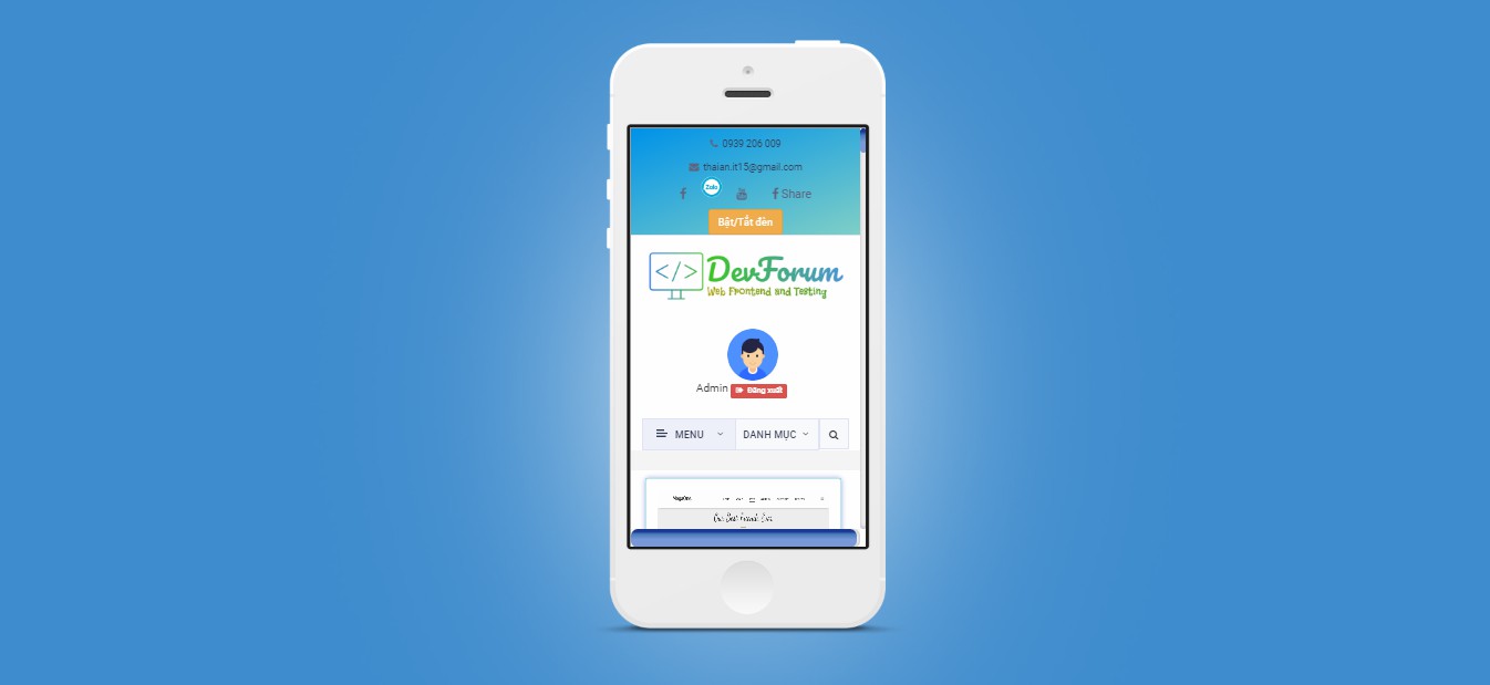
DevForum chia sẻ các bạn code làm công cụ bóp màn hình website theo giao diện Iphone Mobile đẹp chưa từng thấy luôn
1. HTML
<div class="background">
		<div class="iphone">
			<div class="screen">
				<iframe src="https://devforum.info/"></iframe>
			</div>
		</div>
	</div>
2. CSS
/*	Basic Reset and General */
* {
  margin: 0px;
  padding: 0px;
}
html,
body {
  -webkit-touch-callout: none;
  -webkit-user-select: none;
  -khtml-user-select: none;
  -moz-user-select: none;
  -ms-user-select: none;
  user-select: none;
}

div.background {
  position: absolute;
  top: 0px;
  left: 0px;
  min-width: 435px;
  min-height: 1000px;
  height: 100%;
  width: 100%;
  background: #408dce
    url("https://hoidrop.s3-us-west-2.amazonaws.com/cp_social_app_background.jpg")
    no-repeat center center;
  -webkit-background-size: cover;
  -moz-background-size: cover;
  -o-background-size: cover;
  background-size: cover;
}

/*	The Device */

div.iphone {
  height: 810px;
  width: 435px;
  position: absolute;
  margin: auto;
  top: 0px;
  bottom: 80px;
  left: 0px;
  right: 0px;
  background: url("https://hoidrop.s3-us-west-2.amazonaws.com/cp_social_app_iphone.png")
    no-repeat center center;
  -webkit-background-size: cover;
  -moz-background-size: cover;
  -o-background-size: cover;
  background-size: cover;
}
div.screen {
  height: 568px;
  width: 320px;
  position: absolute;
  top: 119px;
  left: 59px;
  overflow: hidden;
  position: relative;
}


iframe{
  height: 100%;
  width: 100%;
}
3. JAVASCRIPT
Mong bài viết giúp ích được các bạn phần nào trong thiết kế Web. Hãy nhấn nút Chia sẻđể mọi người cùng học hỏi kiến thức mới nhé. Cảm ơn các bạn đã quan tâm Forum.